Having fun with perspective in CSS
Something I'm really not familiar with is CSS, and I must say that since I started this website I'm starting to understand the complexity of the subject..
I've decided to try using TailwindCSS to help me styling my website.
3D Perspective
The other day I found this tweet from @CodyWebHouse
And wanted to try it out myself.
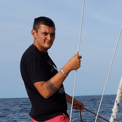
I created a ProfilePicture component:
export default function ProfilePicture () {
  return (
    <figure className={styles.imageContainer}>
      <Image
        src="/images/profile.png"
        alt="m4nu56"
        layout="fill"
        quality={100}
      />
    </figure>
  )
}
And applied the same CSS rules as indicated in the tweet:
.figureCentered {
  @apply text-center;
}

.imageContainer {
  @apply w-56 h-56;
  perspective: 1500px;
  @apply mx-auto;
  img {
    @apply rounded-full;
    transform: rotate(0);
    transition: .3s;
  }

  &:hover img {
    transform: rotateX(15deg) rotateY(-18deg) rotateZ(3deg);
  }
}
And Tada! Try and move your mouse over the image to see it rotate to the position I indicated in the transition
You can also checkout this cool tool that help you find the right transform angles to apply to your image: https://svelte.dev/repl/4cc162b7beda497ea220dfbf950e8746?version=3.29.7